Motiff has been discontinued. Data export is available until October 31, 2026 Export now
Minimalist Tech Accessories - MONO
Wireless charging, perfected. Swiss design meets modern technology
Prompt
Tag
E-commerce
Lifestyle
Case Introduction
MONO is a minimalist tech accessories brand website showcasing premium wireless charging products. This case features a complete brand experience including landing page, technology, support, and about pages, all designed with monochromatic palette, Swiss design influence, and generous whitespace.
More Related Cases
Real-world designs created with Motiff AI across mobile and web platforms
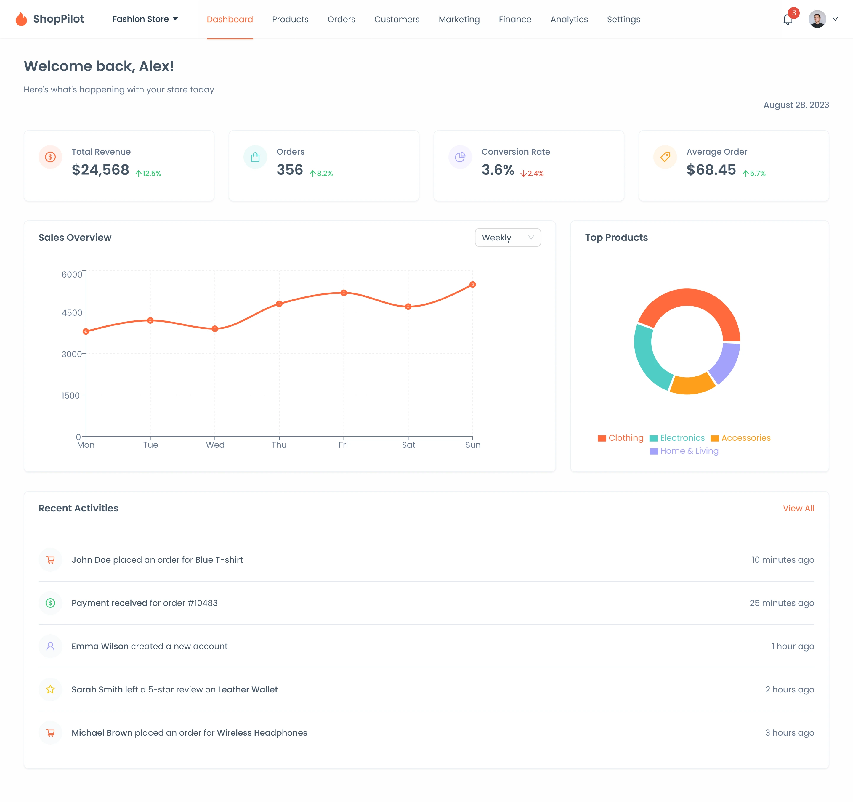
E-commerce Management System - ShopPilot Admin
Manage your online store with comprehensive tools.
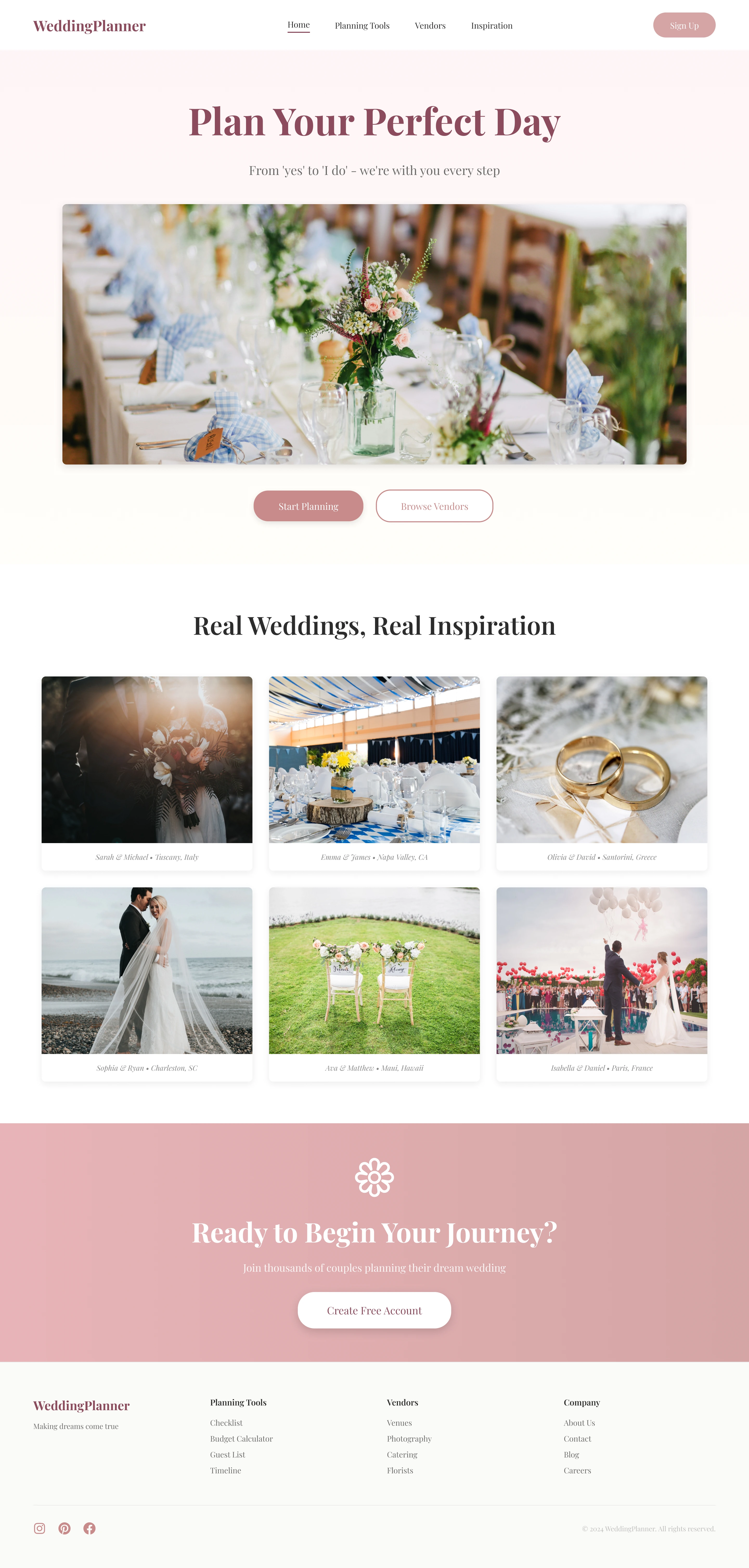
Wedding Planning Platform - WeddingPlanner
Plan your dream wedding with smart tools and seamless coordination.
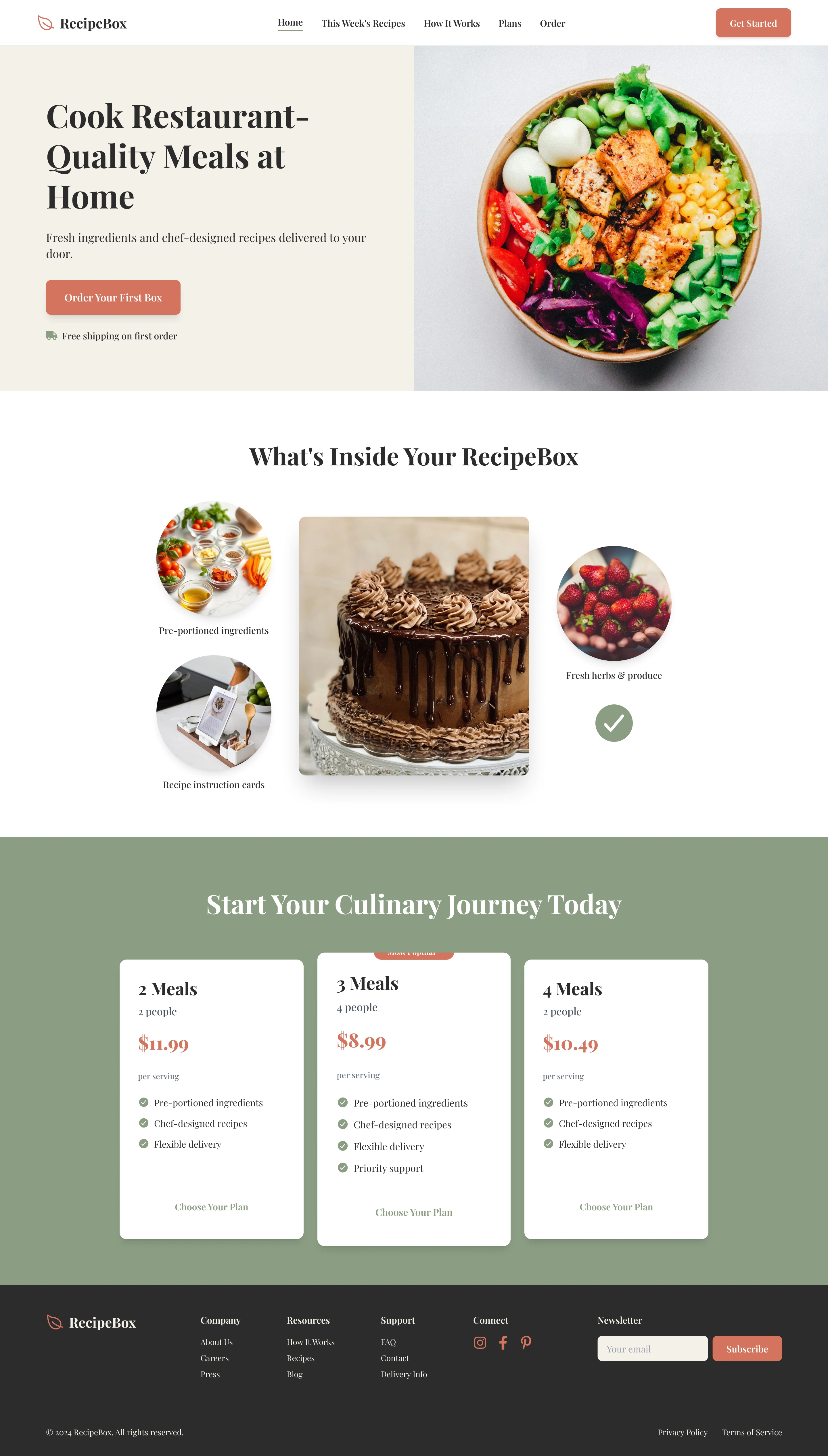
Meal Kit Delivery - RecipeBox
Get fresh meal kits delivered with easy recipes and premium ingredients.
@2026 Motiff PTE. LTD. All rights reserved.